Print Effect
Bringing big ideas to life
WOO was commissioned by Print Effect to embark on the brand identity design and rollout the complementary marketing collateral used to promote the business.
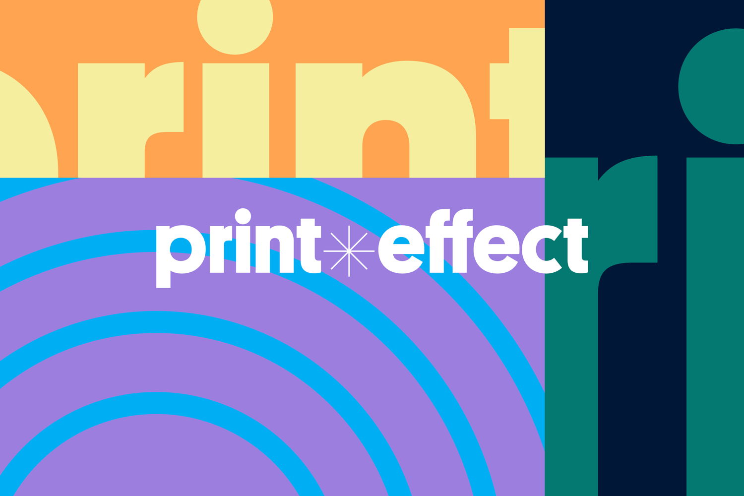
WOO chose to portray an energetic, playful and approachable identity inspired by the nature of the client’s core business: bringing images, and businesses to life through printing.
Our selected imagery and colour combination reflects the client’s main service, taking visual cues from the behind-the-scenes process of a print job.
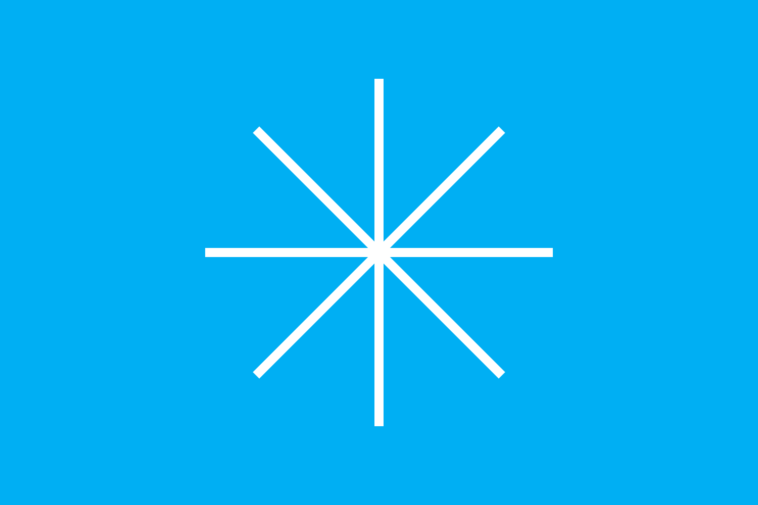
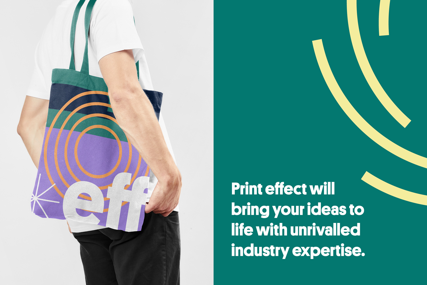
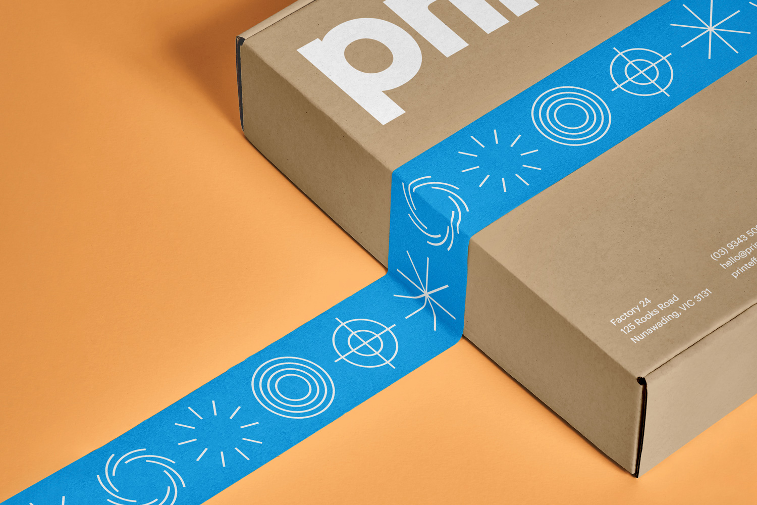
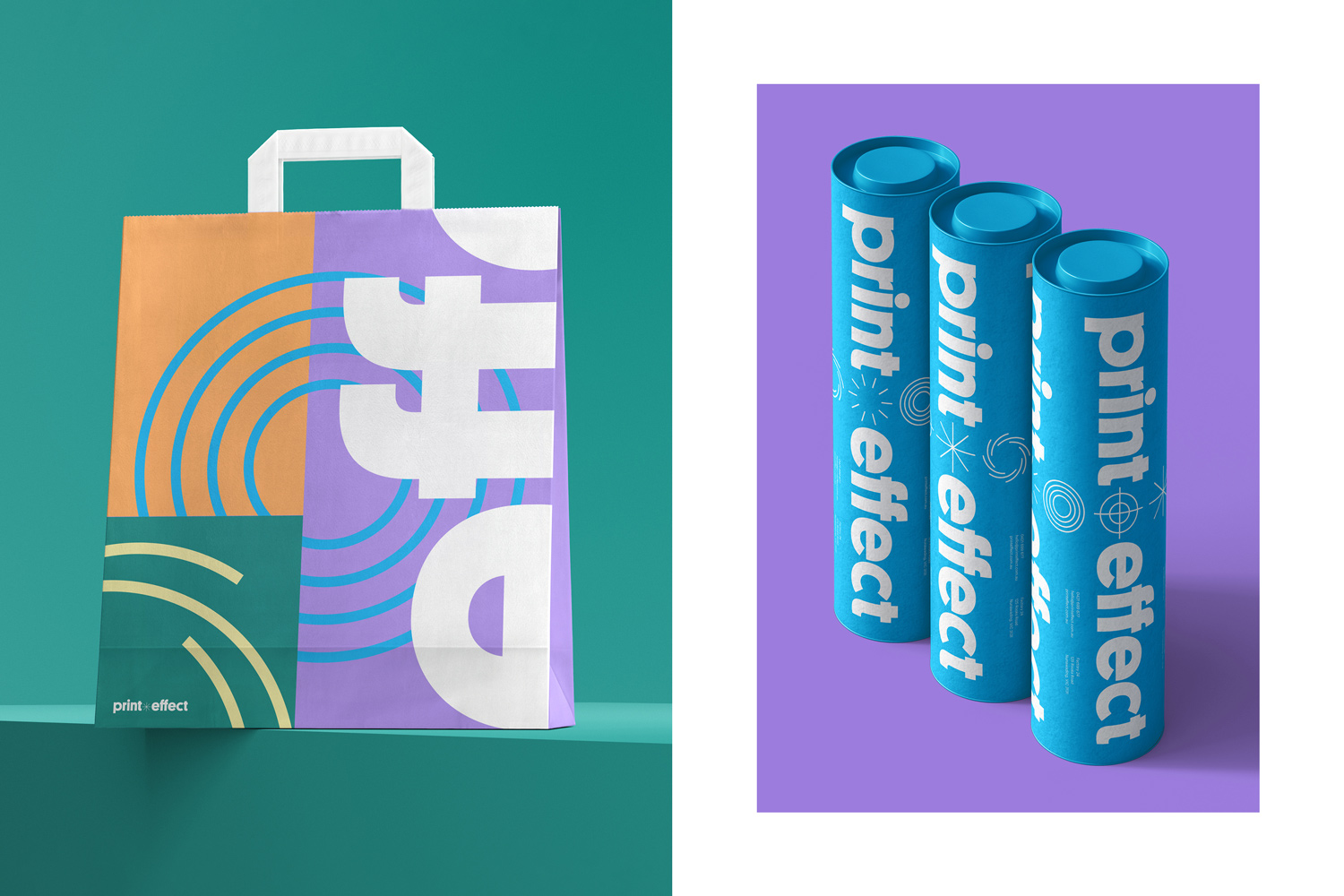
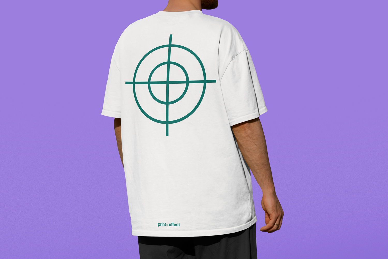
The extended graphic language is made up of a series of collaged segments of colour, symbol and type suggesting the offcuts of a print job that otherwise would go to waste. These symbols purely function as a guide for printing, and are thrown out after. But there is something visually arresting in the look, long after they’ve been trimmed from the paper and left on their own. For the logo and the key visuals, we based our inspiration from the icons test-printed on paper. The registration and calibration marks serve as visual guides to help the printer determine the different separations in a color document.
We repurposed this often forgotten imagery to create an ode to the brand’s service offering. Whilst straightforward, and simple, it creates a meaningful brand story.
To enhance the poppy imagery, a colour palette of bold colours were selected to playfully bounce off of one another. Cyan is the main colour of the brand, linking to CMYK colour printing. An array of secondary colours have been chosen to reflect all corners of the colour wheel and colour reproduction capabilities.